
Guinness Gets A Beautiful Update
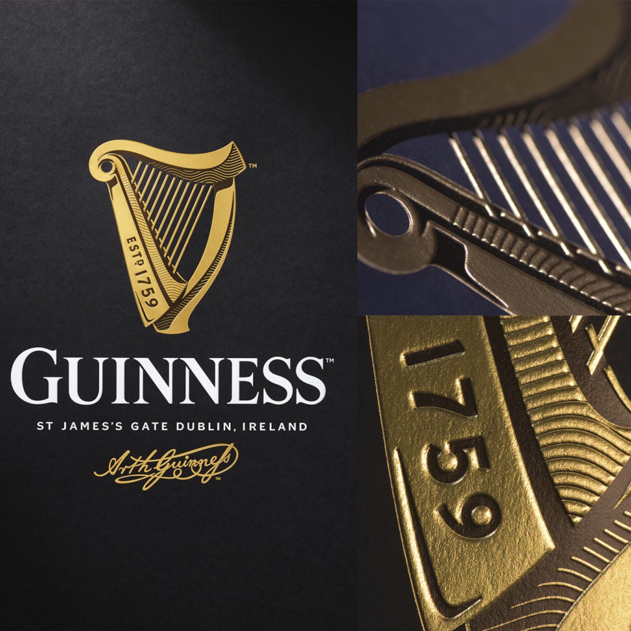
Guinness got an exceptionally lovely new update recently. Having a harp in it’s branding since 1862, the update saw the logo move from a flat design to a lovely handcrafted one with depth and shading. It must be incredibly daunting to be in charge of rejigging such a well-known and established brand but I think the result is really goergeous:
You can read more about the process in this really great article on Creative Review.


